Packaging and labeling have always been essential magical tools in the urban Hoodoo tradition. Product labels are vital in increasing brand visibility and spiritual or magical perceptibility. Spiritual supplies manufacturers communicate the product's value to the customers and spiritual entities through artistic labels. It's one of the essential means of communication between the brand, the root workers, and the spirits they work with. The product labeling contains crucial occult information that is printed on the packaging. Labeling is not just about branding and product promotion; conjure workers believe spirits note far more critical symbolisms when they see the labels.
Due to this, marketers began marketing Hoodoo supplies and paraphernalia with attractive labels and graphics in mail-house order catalogs, Jewish and Chinese drugstores and pharmacies, and spiritual supplies shops.
In the years before the Civil Rights movement and the "Black is Beautiful" revolution that evolved from it, African-American and Hispanic women consistently hawked cosmetics, hygiene supplies, and home-care products with transparent Westernized motifs. The socio-cultural pressure to achieve the broadly accepted 'American' beauty standard, much like the pressure cast on American women of all colors, shapes, sizes, and backgrounds, was prevalent long before Jewish chemists and pharmacists like Morton Neumann, Joseph Menke, Morris Shapiro, and LeRue Marx came along. What these individuals did do, however, or should I say what their graphic designers did do - thanks to the provocative nature of their label designs - besides helping to shape the urban Hoodoo world, also gave a new commercial platform to an unashamedly more homey, progressive, literate, domineering, aggressive, romantic, and sexualized images of the modern Black women.
Jewish-owned manufactories then became known for their stylized packaging and advertisements, which featured illustrations and photographs of African-American models. Notable graphic artists who illustrated the product labels and ads were Charles C. Dawson and Jay Jackson, both African-Americans; the former was even a Georgia native.
Following the ancient belief of native Africans concerning the significance of symbolism and imagery, these designs were created to share and understand the meaning of advertising messages. African Americans, including conjure workers and artists alike, are attached to images because of their ancestral consciousness. Traditional signs and symbols are considered dynamic human activities and conditions that touch every living domain for meaningful development and peaceful coexistence.
The illustration of symbols and other imagery is a tradition of Central West African origin. Animal prints, geometrical figures, line patterns, ritual emblems, and figurative rock and wood arts are attested in the slave trade regions. Therefore, the practice of giving significance to symbolic and allegorical imagery in Hodoo owes its origin to African cultural convergence.
 |
| Figures wearing Arabian or Indian-style headscarves, tignons, and turbans once became a personification of a wealthy and successful businessman. Orientalism became fashionable and opulent among the general populace during the 19th and 20th centuries. Due to this, genie lamps, incense burners, oil lamps, Asian elephants, and even Allah's name, which is written in Arabic script, also became symbols of enterprise, luck, and abundance. |
We are not sure if this directive came straight from the Jewish merchants or from the influence of their Black colleagues and employees, but the lovely novel artwork, along with catchy product names like "Follow Me Boy" sachet powder, "Kiss Me Now" perfume, "Essence of Bend-Over" floor wash and "Red Fast Luck" dressing oil became calling cards through the entire history of Hoodoo. The cosmetic mail-order catalogs gave their target clientele apparent cause-and-effect scenes of the passionate and auspicious moments awaiting them if they used the product.
To get acknowledged on a pharmacy or occult shop shelf or in the hands of a door-to-door salesman, these Jewish merchants felt the best response was to employ mostly black designers, salespeople, copywriters, and factory workers. These people could also market their concoctions in a style and language more likely to resonate with the intended market.
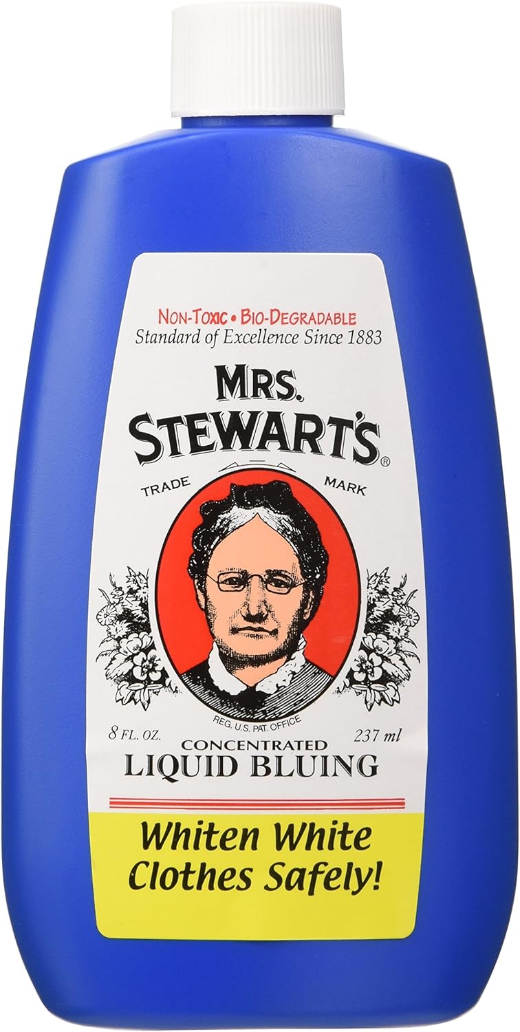
Labels helped build brand and product efficacy, spiritual recognition, and communication, promoting consumer loyalty and magical potency. However, the most effective signs and symbols would be those that the consumers could easily culturally and consciously relate with since a familiarity bond had previously been created. Hence, most symbols they used were those items or curios, commonly used in spell works, that evoke the "lucky" imagery of the brand name, such as heart, four-leaf clover, wishbone, horseshoe, dice, eye, key, black cat, hand, crown, star, etc.

 |
| Dedicated collectors now scour the globe looking for rare tins and bottles of these vintage products due to the artistic merits of those stunning labels. |
More often than not, most people think that all products with labels can be used in Hoodoo practice. This is incorrect. A commercial product can only be used in Hoodoo if it passes several practitioners' extensive research and thorough testing. That testing determines the level of awareness and efficiency among mundane consumers or how figurative or emblematic the commercial design is.
The more graphic the product label is, the stronger the product's performance in Hoodoo magic. If the product has a dominant, attractive, and symbolic graphic, it would likely be used in spiritual workings. That is because a strong graphic design means a specific product is first recalled when a specific magical or spiritual condition is mentioned.


 |
| A Conjurer's collection of vintage African-American anointing, rubbing massage oils, hair-care products, colognes, perfumes, ointments, balms, etc. (Photo courtesy of Lucky Mojo Curio Co.) |


 |
| Some of Tim + Neal's labels are anointing and dressing oils. |


0 comments:
Post a Comment